March 27, 2011
“New and Improved” Dennis Lee!

Garbage Delight, 2002.
The poems of Dennis Lee are heavily favoured in our house, and so I was pleased to find a new volume called Garbage Delight: Another Helping, illustrated by Maryann Kovalski, during our last visit to the Toronto Public Library. It didn’t take long for us to realize that this wasn’t, as we’d thought, a sequel to the original 1977 Garbage Delight. Instead it’s an abbreviated version of the original book plus “some delicious new verses”, completely re-illustrated by a new artist.
I don’t think I’m just being nostalgic when I say I find this disturbing. As anyone with young children will tell you, the reading experience provided by a picture book is different experience than that provided by a chapter book, or a story told out loud. The pictures inform the child’s imagination just as much as the words do. Their eye follows the words and images, whereas they might not glance at the book at all during a chapter book. When you think of a favourite picture book, you’re thinking as much about the pictures as the story. Would Goodnight Moon still be Goodnight Moon minus Clement Hurd? Or The Paper Bag Princess minus Michael Martchenko? You certainly wouldn’t demand that classics illustrated by the author – the works of Dr. Seuss, Shel Silverstein, or Eric Carle – be taken apart and put together differently. Why treat author/illustrator teams differently?

Garbage Delight, 1977.
I don’t mean to say the book wouldn’t have been good illustrated by a different artist, but it would have been a different book. What disturbs me is how blatantly a re-imagining like this puts primacy on the words. Garbage Delight was a huge critical and commercial success when it was first released. Something about it resonated with the audience. In having it re-illustrated by a new artist the publisher (or author, or whoever decided this was a good idea) is assuming the text alone was responsible for that reception, and that an equal (or better) reception can be expected with new pictures.
The book industry seems stacked with people who make this error in judgement. Look at the popular attitude towards graphic novels. But any savvy graphic novel reader will tell you the graphics and the novel can’t be separated. Jeff Smith’s Bone, Dave Sim’s Cerebus, David Mak’s Kabuki – even team-written works like Alan Moore & Eddie Campbell’s From Hell or Jillian & Mariko Tamaki’s Skim – are works to be taken whole.
Why would a picture book be any different? In this case, I fear the answer is to be found in the ego of the author. Dennis Lee’s issues with Frank Newfeld were well-aired by Newfeld in his 2008 autobiography Drawing on Type. At the time I read and reviewed Newfeld’s memoir, I felt his take-down of Lee was rather juvenile (and it still seems pretty petty), but it now also helps shed some light on why Lee, a living author, might have condoned all of these re-releases of his older material with newer, duller, safer illustrations. He really feels these are his books. Newfeld points out the difference in his philosophy of illustration and Lee’s:
“Dennis felt that the illustrator’s only function was to describe the poet’s invention – to translate it, exactly, into the visual realm. Whereas I argued that the role of the illustration…was to challenge the child to take the poet’s flight of fancy and use it as a spring-board for his/her own invention.”
Frankly, I’m on-side with Newfeld. Authors are, of course, free to pursue whatever result they want with their words, but a picture book is not just an adult book with some colourful bits stuck on to attract the eye of an illiterate child. After all, kids (and grown ups) continue to enjoy picture books long after they learn to read and no longer need the visual cue of the images. The pictures bring more to the whole than representation. They are an entirely different level of the story, or poem. If the author can provide these themselves, great. If an artist is brought in to illustrate, their interpretation uniquely interprets the words. They are partners in the enterprise.
The new Garbage Delight fell flat in our house because Maggie found the inexpressive little raccoons confusing – she kept asking why they were all “sad”. She has always preferred images of children to anthropomorphic animals – but maybe that’s just us. I feel a little annoyed that I was tricked into picking up a book we already own – you’d think I’d be more careful. But I have absolutely never encountered this phenomenon before, and was not watching for it. Why re-assign your text to a new illustrator when the original was so successful? It feel straight-up like an insult. Even if I wasn’t the intended recipient of that slap, it’s embarrassing to see it on the shelf. I really hope I won’t ever see it there again.

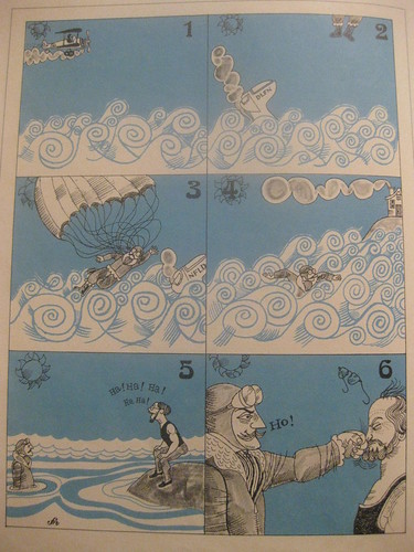
Pretty much exactly how I imagine the Lee/Newfeld relationship - from Garbage Delight, 1977.
One thought on ““New and Improved” Dennis Lee!”